

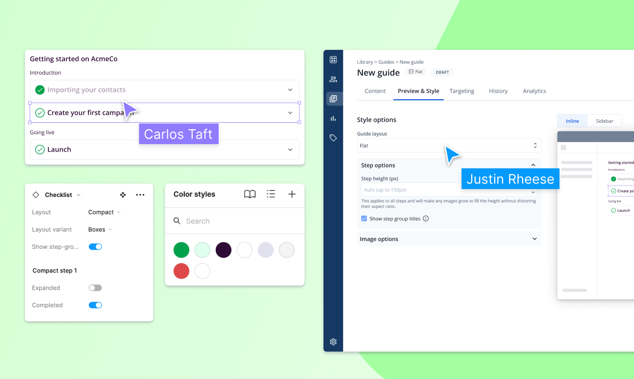
Table of Contents
When designing an onboarding experience, it’s easy to assume a certain form factor like a “modal” or “tour”.
But imagine if onboarding into TurboTax was simply a bunch of pop-ups that said: “enter your [insert financial term] here, here, and here” (and was 129 steps long)?
That’s also clearly wrong.
Picking the right form factor starts with understanding your user’s journey and your shared goal of helping them get to success, and it’s certainly not one-size fits all.
What’s the right form factor for user onboarding?
Check out our library of form-factors in Figma here.
How long is your onboarding (steps)?
To start, how long is your onboarding? If it’s as simple as uploading a picture and following a few friends, those steps should be just baked into the actual flow.
If, however, there are 10+ steps, some of which require different users to participate, a single flow doesn’t make sense.
Similarly, if your onboarding could have 10+ steps, consider grouping them into chapters, so that a user isn’t feeling overwhelmed by a list that visually looks intimidating.
Is your onboarding intended to motivate the user to action?
Admin-users usually have to complete a critical set of tasks in order to complete their onboarding, whereas sometimes an end-user simply needs to be pointed to the right place in the app to “see” a report or other piece of information.
If users don’t need to take action, then a form factor that makes them aware of where to find something is enough. If they need to take action, then the right form factor has to acknowledge those actions, why they need to be done, and ideally reflect back to the user when the action has happened.
Too often, we see onboarding styles that intend to drive users to action, instead present them as “hey check this out”.
How long is your onboarding (time)?
Mobile-app onboarding has to happen in a single session, or else the user will bounce and go do something else. That’s why they rely frequently on swipes and modals. But B2B SaaS onboarding often takes place over multiple sessions. Admin users get set up over the course of multiple days or even weeks, and end-users might adopt a different part of the product across each of their sessions as their use case evolves and becomes more sophisticated.
Pick a form factor that “lasts” as long as your onboarding
If your form factor is a modal that, once dismissed, is forever gone, it’s inconsistent with onboarding experiences that take place over time. One of the biggest mistakes we see is using an ephemeral form factor for an experience that is long-running.
Popping up the same modal on every login doesn’t solve the problem – it just makes users feel annoyed.
Instead, give them an experience they can land into, or return to, as they progress.
Why onboarding checklists make for great empty states in your product
Hot take: product tours, modals and tooltips are not empty states. Empty states are when content can’t be shown, often because the user hasn’t taken the necessary actions for that content to exist. For example, in Bento, the “customers” list is empty until the Bento snippet is installed and data about customers flows in. To slap a modal on top of that screen doesn’t solve the fact that once closed, that screen is still empty.
Overlays are not empty states.
Great empty states are informative and drive action
The purpose of having empty states is to drive users to take the necessary action so that the area is no longer empty. It also helps the user understand what will show up there once it’s no longer empty.
Inline documentation is a great use of empty states
Carbon Design Systems has a great overview on designing effective empty states, specifically highlighting that “in-line documentation is an extension of the basic empty state for first time use. It can be most helpful when a primary feature is first introduced, providing more detail and highlighting any benefits. Including an image of the space populated with data may help trigger interest and usage. Following a progressive disclosure model, it could provide links out to more detailed documentation.”
Onboarding checklists is the most scalable form of inline documentation
The most critical empty state is likely to be a dashboard where a user lands for the first time. Instead of designing that empty state from scratch, embedding an onboarding checklist that motivates a user to action is a far more scalable solution.
The checklist should still embody the best practices of that empty state:
- Highlighting benefits
- Linking out to detailed documentation
- Promoting key actions that will make the empty state no longer empty
You can control redirect logic when treating your checklist as an empty state
Finally, by embedding an onboarding checklist into a dashboard, you can ensure that every time the user logs in and lands on that critical page, they’re greeted with the most important next steps. And when they’ve completed the steps in that list, that content should disappear and be replaced by the intended content, be it key metrics or an activity feed.
For some apps, there isn’t a “home dashboard”; in those cases, an onboarding page can be separately created (for example, called “Getting Started”). You can start every new user session on the page until the onboarding steps are completed, or, start the first 2 or 3 sessions there, and then start each session on a different product page for subsequent sessions.
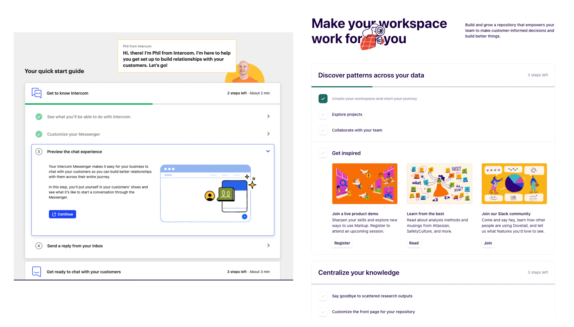
Onboarding Checklist layouts
And that leads us to different design types for onboarding checklists. These are some of the most common ones that we see. We've gone ahead and pulled them into an easy-to-use Figma community template here.
Accordion list
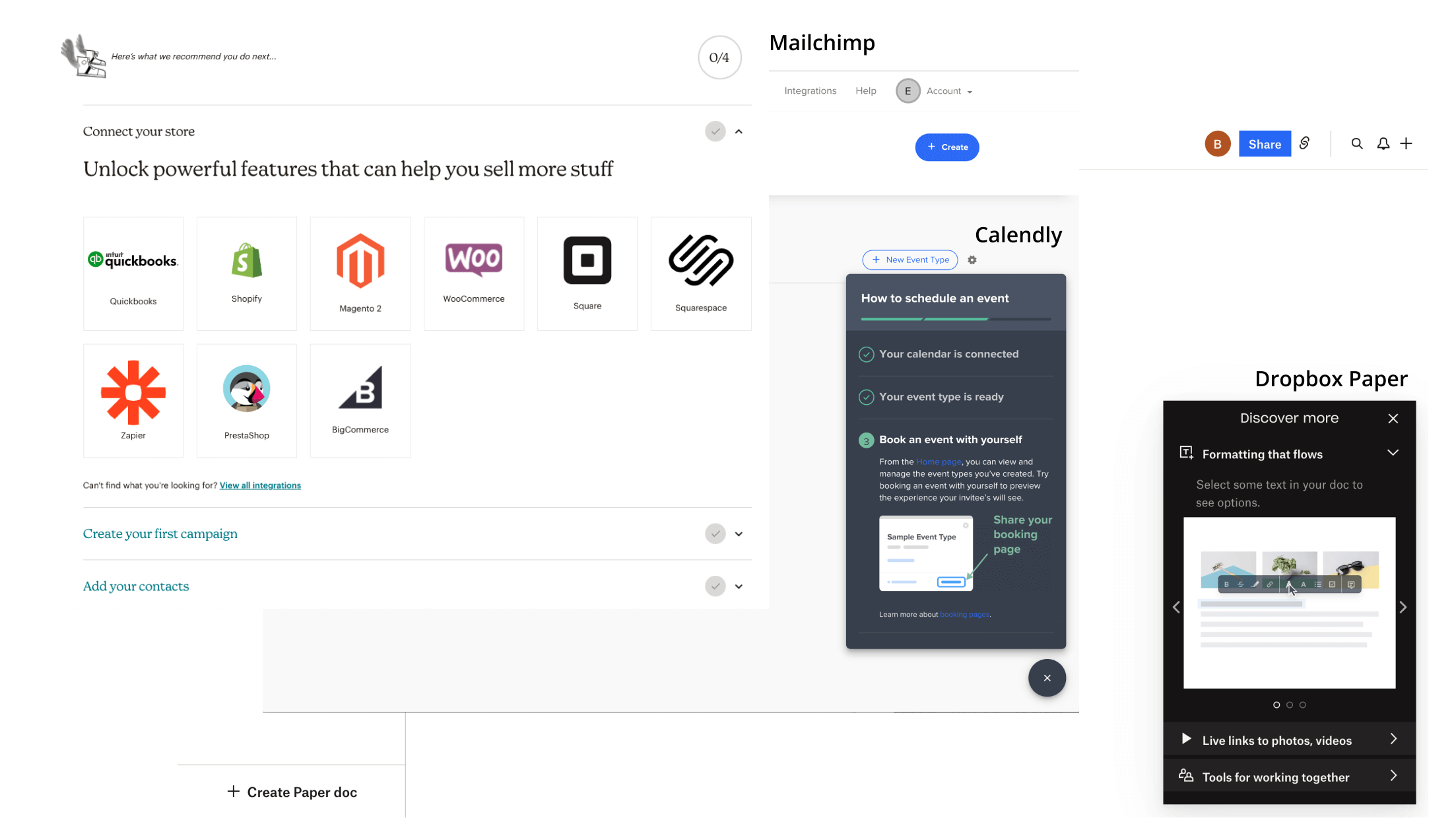
This is a really popular one across SaaS apps. At a high level, users can scan the steps they’re meant to accomplish, and click into each to watch a video, read more about best practices, and engage with some type of call-to-action to take action.
Flat list
We often see developer-focused tools using a Flat List that clearly lays out the recommended steps, but relies on quick navigation and linking to documentation for details.
Why have onboarding if you have documentation? Documentation can explain the how but onboarding lays out the journey, the why, and the best ones track progress on what’s been done. This way, the user can pick up where they left off across sessions (because, come’on, no one is “done onboarding” after the first session.
List that slides into a separate page
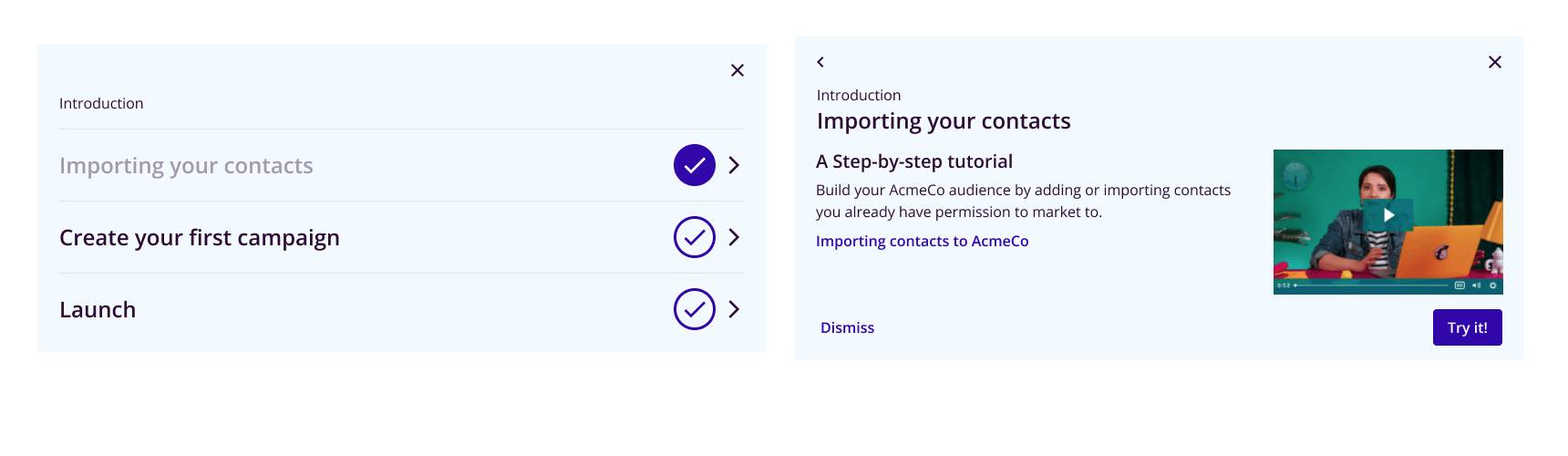
A variation of the accordion is a list that, on click, exposes the step details in a separate view. This works well if onboarding is one “card” on a longer landing page because it won’t push the rest of the page’s content down too much.
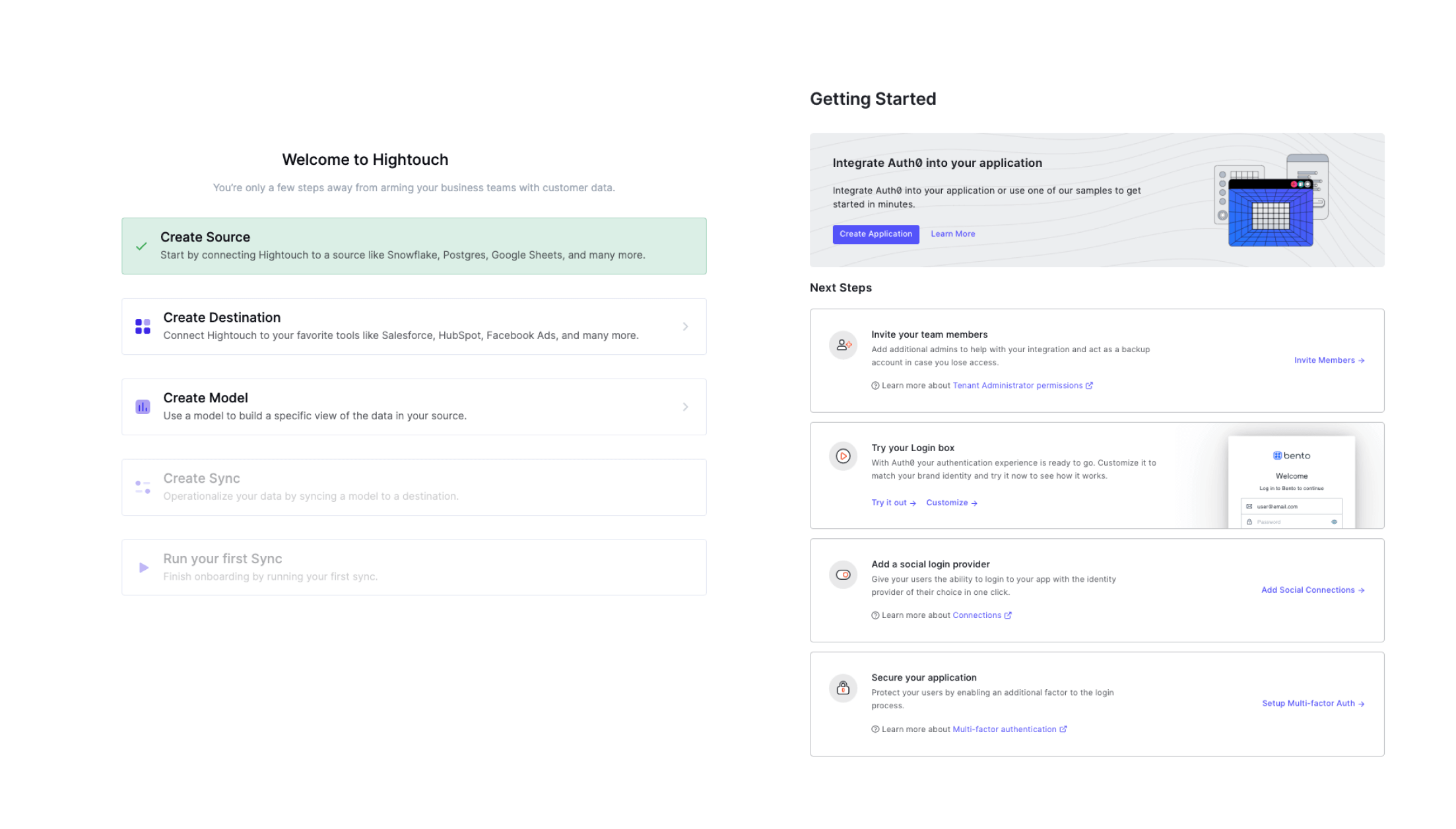
Nested lists
Finally, for onboarding that is more intensive, or requires collaboration across multiple people, nested lists can expose and track substeps within a section. For example, configuring a particular workflow might itself have 3 or 4 specific decision points with best practices. By nesting steps into groups, the user can more easily step back and orient themselves.
What steps should go into a user onboarding checklist?
One of the key differences between a user onboarding checklist and a product tour or modal sliders, is that users are meant to take action. That means it’s critical the content on the page is a mix of action and information about the benefits of that action.
Experiment with bullet pointed lists and videos for info steps
Users don’t sit and read. And unlike help centers and documentation pages, in-app guides and onboarding content are usually constrained to smaller containers like a card, a banner, or a sidebar.
Don’t copy and paste your help center into your onboarding guide.
Informative steps should be focused on setting context for why the particular step or action is important and valuable. Form factors like bullet points are effective, but if you find yourself wanting to share context or best practices, a short (2-3 min) video is great.
Platforms like Loom allow you to film lightweight videos easily, and products like Bento embed them natively into your guides and flows.
Best practices with videos.
- One watch-out with videos is that they’re prone to deleting (especially “low friction” products like Loom). Bento will send you a notification if it detects that any embedded videos have been removed, but you’ll have to manage that workflow if using other methods.
- Otherwise, keep videos short. One benefit is that if the UI for a particular part of the video has changed, you’ll only need to re-record a short section instead of the entire video.
- Keep “top navigation” out of the frame. This one is counter intuitive, but by keeping navigation out of the frame, you’re less likely to need to update a video because the navigation changed (even if the core functionality has not).
Action steps should focus on “what and why” but not the how.
The bulk of your onboarding content should be driving (and tracking) key action. As you lay out the actions, consider this the “playbook” and not the tutorial. Why?
By and large, your product’s core UI should handle the “how” intuitively. But even if task completion is obvious, the benefits of doing something might not be. The reason to have in-app guidance even when the product is “intuitive” is to highlight the value for a particular persona or use-case. Once the user is motivated, the job of getting them to perform the action correctly is largely your product UI/UX’s responsibility.
- If there are known usability issues, you can call out suggestions as a “watch-out” instead of a long “step by step”.
- Otherwise link out to a help center article for deeper
Leveraging tools to experiment with onboarding checklists
Now that you have your key list of steps, and a layout variation you’re excited about, time to get building, right? Right?
It depends.
If your application serves different personas or you plan on iterating, building this all in-house will mean a rebuild and a re-prioritization with engineering, every time you change this. Tools like Bento allow you to choose among the most popular layouts (yes, all the ones we listed above), customize them to fit your brand, and build scalable personalized paths.
Once you have your content in mind, building it and setting it live with Bento is a matter of hours, not days and weeks. From there, play with the different styles and see what works best!


